
Gaining credit - Our design journey into expanding Venmo

Venmo Credit Cards
Gaining credit — Our design journey into expanding Venmo
For more than a decade, Venmo has been synonymous with sending money between friends. As Venmo matures, its goal is to become a ubiquitous digital wallet that lets consumers spend and pay at local businesses, as noted in MarketWatch by GM Darrell Esch.
As all good design journeys begin, we started the Venmo Credit Card journey by partnering with our research colleagues to understand what credit means to Venmo users. We wanted to make sure any solution we developed would stand out in a sea of credit card offerings and have a unique Venmo voice.
Understanding credit — working with research

Research Participants Details
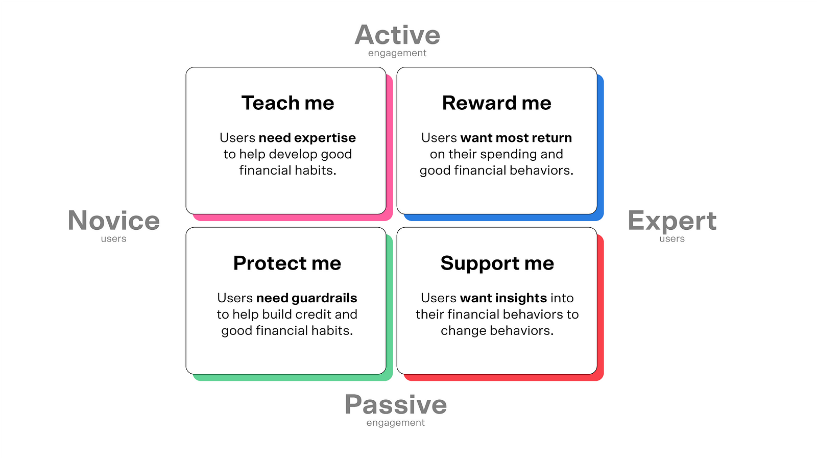
Needs matrix of Venmo users
Customer Journey — mapping out the product
As we started to map out our MVP with the product team and banking partner, we began by identifying the jobs to be done (JTBD) at each stage based on the need states defined during research. We used this method to help us organize the core experience needed to start generating early-stage concepts and use them to craft a vision.
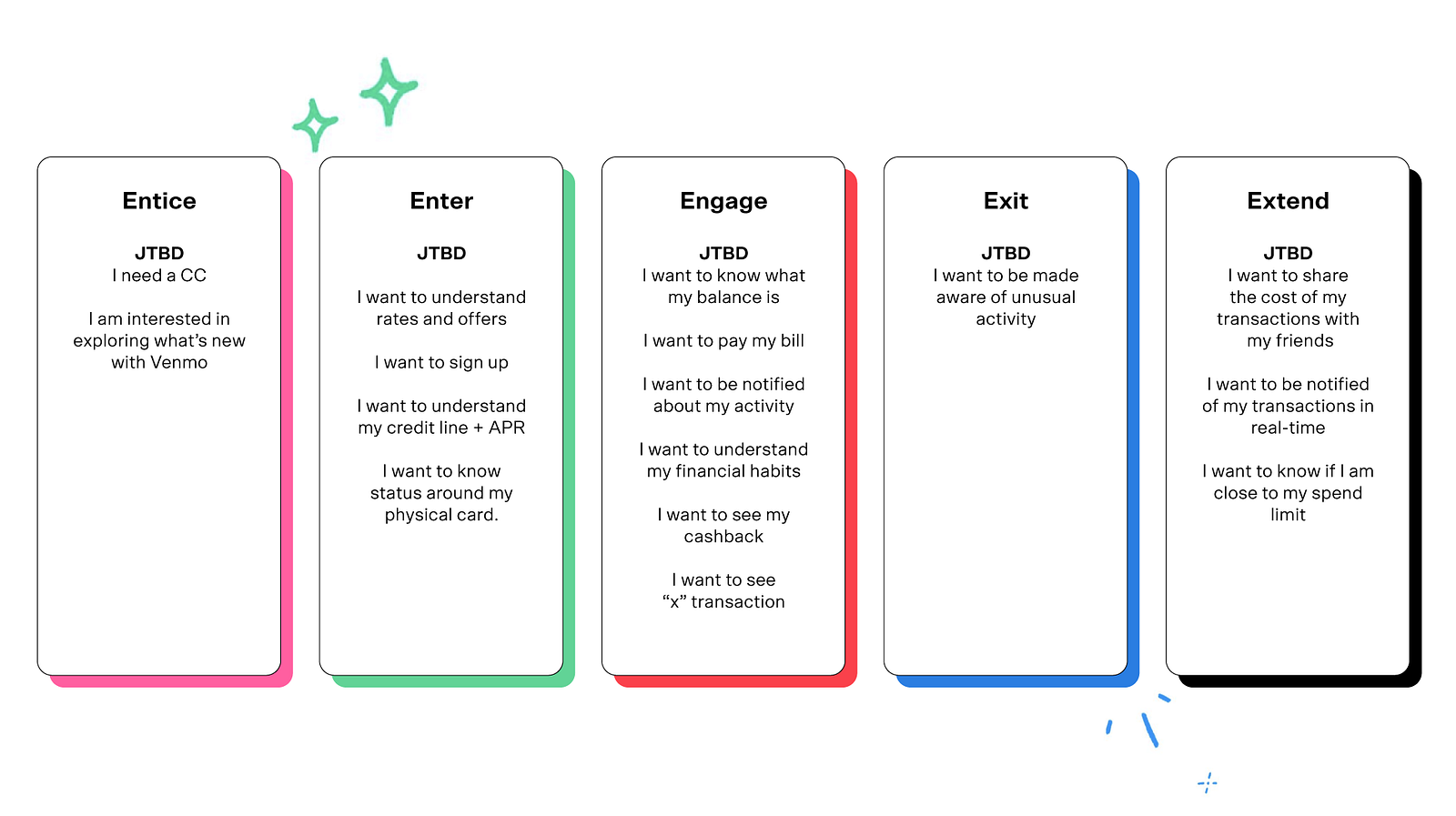
Small sample of the JTBD for the Venmo Credit Card
Finding a structure for the jobs to be done — developing the information architecture
It was essential for us to bring that special Venmo-ness to our experience and make the overall interactions feel fun yet simple. We continued working with our research partners and content partners like Marty, DeeAnn, and Dianne, who helped us refine our overall storytelling and start shaping that friendly Venmo tone and voice.
We looked at best-in-class digital experiences because we wanted to create a world-class, mobile-first experience that felt like a favorite phone app to customers.
The information architecture for this feature was going to be complex. We had identified upwards of 30+ JTBD. We needed to start editing and making choices around where tasks would live, what the overall home screen would start to look like, and what could be included for MVP.
Core tasks included managing balance, checking transactions, looking at cashback rewards, and paying bills. Customers would also need to easily perform tasks like reporting a card stolen, deactivating a lost card, and setting up autopay. The list of items we deemed important was growing. As we started initial sketches, we quickly realized that we had to start making some groupings based on their frequency.
We landed on introducing layers and utilizing the z-axis, which would help us nicely nest all frequent actions on the top plane and infrequent actions on the secondary plane.

Using the z-axis as a core organizational structure
As we developed this model, we wanted to make sure we couldn’t lose the layers' discoverability. We introduced a micro-animation that appears every time a user taps into this feature on the app. Many considerations went into length and speed so that it wouldn’t become tiresome over time.
Micro-interactions on the credit card feature
Once we settled on the overall structure, we began organizing the frequent tasks on the main layer. The top lock-up comprised the most important tasks — I need to know my balance, know how much I have left to spend, pay my bill, and know the due date for that payment.
The simplicity achieved here took many weeks and a close partnership with content and product. We did many variations of this and a round of user testing to ensure the customer's screen had clarity.
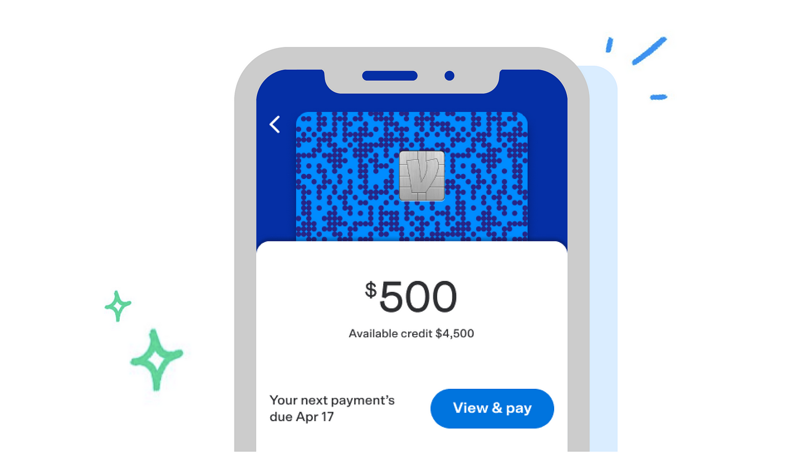
Main JTBD lockup for account summary on Venmo Credit Card
Next, we looked at the remaining tasks and realized it made the most sense to give each its own separate entry point. A tabbed controller was the best component, as it provided users an easy way to see the sections and choose where they needed to navigate.
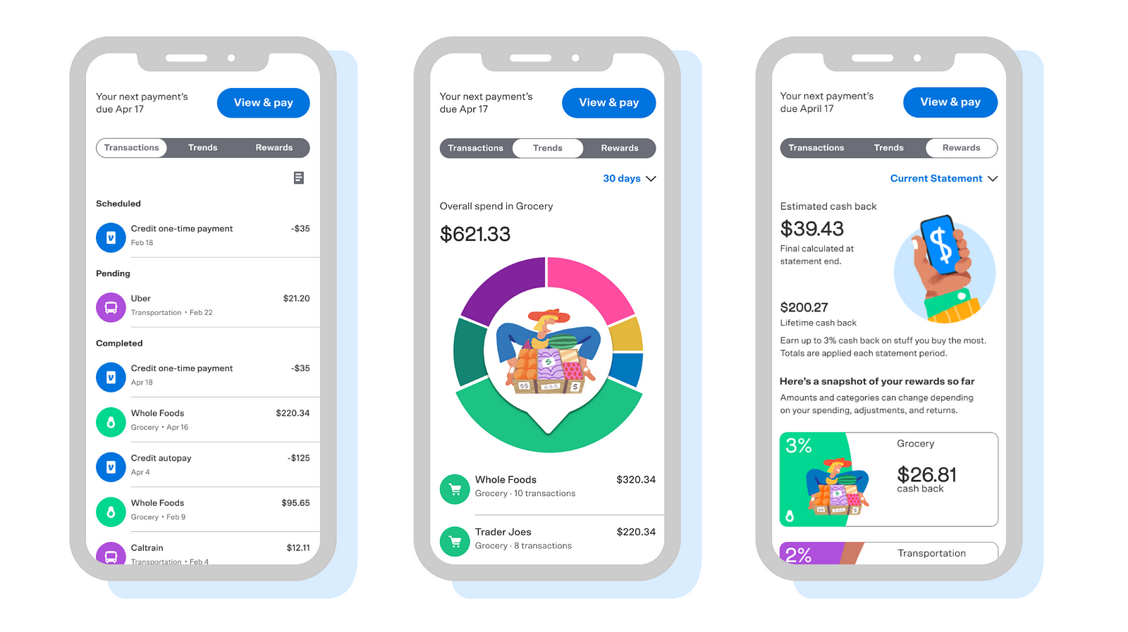
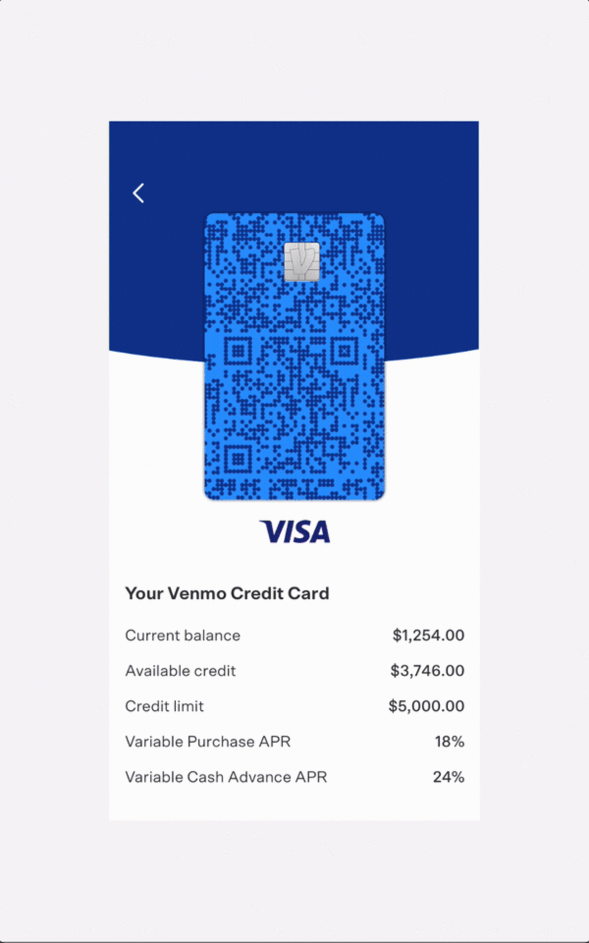
Account Summary on Venmo Credit Card
The thing about spend patterns — Developing the trends feature
One of the early insights we uncovered was that people have difficulty managing budgets because the data coming in can be so fragmented. We tried many concepts to show people insights, help them find the trouble spots, and learn to change their financial habits.

Early concepts for trends section
In designing this feature, we were thinking a lot about teach me and support me need states, which encompass a big chunk of Venmo customers. We wanted to provide a solution that helped people understand their spending habits to make better choices.
We saw two variations in our competitive research around how best-in-class companies were solving this issue.
Transaction lists: This is a remnant of a ledger or receipt, where you can see a line-by-line entry of transactions traditionally arranged by date of spend.
Filtering: For the few companies that offer filters, you can see a list of merchants’ transactions, but the user still must do the math around the overall dollar amount and number of transactions.
We believe once you start to see a holistic spend on a 30–60–90-day continuum, you can begin to see patterns that are useful and create shifts that work with your lifestyle.
We landed on a wheel pretty early on. The bar charts and graphs didn’t work quite well in showing a holistic picture without adding too much of a cognitive load. We spent a lot of time refining the wheel so that the pointer's direction and shape would work for small and large slices.
Our solution includes an interactive spinner that customers can tap and engage with, and quickly see the categories they spend money in. We default to the biggest category open, with a list of transactions below.

Early pointer explorations
When customers dig in by category, we show a high-level summary by the merchant that gives overall spend and transactions with that merchant. For a full breakdown of transactions, one tap surfaces a tray organized by highest to lowest spends.

Left: Trends wheel Right: Tray with the merchant details
From a design perspective, we paid a lot of attention to how we represented categories. From our research, we had learned some credit card customers use different cards for different tasks. Some use a different card for grocery or gas, for example, and we wanted to make sure the solution we built could support that use case and engage those who use it as their primary card.
As we thought about the color, images, and icons, we partnered closely with our marketing partner Angela, our resident expert on icons, Liz, and design systems lead Peter. Each of them helped us identify the right visuals and colors to use that were fun, appropriate, and accessible.
The goal was to help users understand the activities/experiences that were associated with that category. As we narrowed images, we wanted to make sure there was the right mix of gender and race representation and sensitivity to people across different contexts.

Trend Wheel — Color, icons, and image system
Developing the intelligent rewards system
Customers think of rewards and cashback as “free/fun money.” When designing a rewards system, we wanted to provide a direct and stable structure that communicated great value.
Many rewards models require opt-in and work only around specific categories or periods. Our early drafts gave people more autonomy, allowing them to choose their preferences for the 3%–2%–1% categories. After testing, however, we realized that monthly spending could vary. We wanted to take the pain away from remembering to update rewards preferences based on monthly spending.
Early concept explorations for rewards
In partnership with Synchrony and our product team, we simplified our construct to do our customers' math. At the end of a banking cycle, we look at spend and provide 3% and 2% rewards in the top two categories, while everything else gets 1% that’s auto-swept into the Venmo balance.
We provide users a daily estimated cashback overview and an overall lifetime cashback to feel rewarded and understand how their swipes with the Venmo Credit Card translate into earnings for them. They also get an individual breakdown of earnings based on the 3–2–1 model, which fluctuates as their spending does.

Venmo Credit Card Rewards
Teamwork = Dreamwork
Given the context of the pandemics across America, I am incredibly grateful to have been part of a team that produced a beautiful product that now lives in the world. We didn’t let the constraints of not being in the same space stop us from collaborating.
Our team consisted of 5 designers, 3 design leaders, 3 product managers, (x) engineers across 4 development teams, partners from Paypal, Synchrony and both legal teams.
We spent a lot of time in daily design reviews, product, and legal reviews where teams across Chicago, San Francisco, New York, and San Jose got together and decided to keep things moving forward.
Below is a screenshot of our Miro board on any given day that looked like this. There were many comments and versioning to make sure we could build the end to end experience and make sure that all of the overlaps.

A day in the life of the credit card project
What I personally learned as a product design leader
A project of this magnitude that sped along at this pace pushed me to my limits as a practitioner. There were several times I had to take a step back, look at the larger picture, or remind myself that it was all going to be OK.
For anyone taking on a project like this, here are some tips to keep in mind.
Share early and often.
As a leader this was a very scary transformation. I wanted things to be pixel-perfect before I shared. It’s how I was trained and it was a hard one for me to give up. Early in the project, I stayed up way too many nights trying to stay ahead of the shifting requirements.
After a particularly grueling weekend that marked my 14th consecutive 12-hour day, I realized I couldn’t keep it up, especially as I was juggling homeschooling for a 6-year-old through all of this. I decided to be more vulnerable and share that I didn’t have everything figured out in my next few meetings. This was the start of the shift in building trust I developed with my product and engineering partners. They started building with me, and I was making decisions without having to try out every iteration.
I wish I had started this process earlier and invited my partners to start a dialogue so we could all go on this journey together from the very beginning and rapidly iterate while building on each other’s perspectives.
Your design is only as good as your engineering relationships.
I cannot emphasize this enough. While creating this project, we discovered the limitations of our design system and had to modify several components and introduce new patterns.
I wish I had built in the time early on to bring in my engineers to help them weigh in on the complexity of what seemed like a simple tweak on the design front. Given that we were all doing this project 100% remotely (at least for the better part of the last year), I wasn’t able to walk over to my development counterpart and share designs as I was creating them. It became easy to forget to bring them in.
The result is proof that we overcame our initial challenges, but it’s a good reminder for any designer looking to introduce motion, micro-interactions, and gestures. Avoid “the too expensive” conversation by helping them get excited about your design vision and giving them ownership in the creation process.
Remember that some days you eat the bear and some days the bear eats you.
This quote came to me via the 5-minute journal on a day I probably really needed it. I have it scribbled out hastily on a post-it that lives on my computer screen. On big projects that span three organizations and 200+ people, there are some days you win battles and some days when the other side wins.
As long as you can remember that everyone on the team has the best intentions in mind, even if they aren’t the same as yours, you can keep on trucking forward until you ship.
I love design, but my real life happens on the other side of this computer. It’s something I constantly have to remind myself.
Remember to check your triggers and not be passive-aggressive. It’s OK if the bear gets you some days. You have to be willing to walk away and come back the next day wanting to get in the game all over again.
I am immensely humbled by this project and have learned so much in the process both personally and professionally.
It is a long list of crime partners at Venmo, but I am so thankful for Micah Alpern, Liz Carter, and Jason Brightman for their leadership. They were always wanting to fight the right design battles and hear me out on days the bear ate me.
Marty Strasen for editing this piece and also shaping the Venmo voice with DeeAnn and Diane.
My team who were co-conspirators in making this amazing experience come to life — Zack, Tina, Juliana, Jeremie, Angela, Jessica, Peter, Craig, Pete, and Antonio. My product partners — Erica and Alec. All of my engineering peers put their hearts into bringing our designs to life and everyone else involved.
Last but not least, I would like to thank my husband Thomas, daughter, and dad, who were immensely patient with me as I went through this journey, especially when the boundaries between work and home were literally non-existent!